
A parchment chart, a glass dial and a command console should feel different. Starting a turn, reading the clock and finding the next player should remain familiar.
Separate the world from the rules
Henge’s theme definition supplies colors, fonts, player accents and presentation options. Timing behavior belongs to the domain model. Spacefleet’s reusable rail styling, for example, is expressed through the same header, tile, sequence and action components, with tokens for band height, rail width, corner radius and ink.
A shared component contract lets a theme influence more than a background color without introducing another timer implementation. Core controls keep their recognizable symbols; decorative glyphs and motifs have a separate job.
Layout is a second choice
Grid, Pie, List and Treemap arrange the same game differently. The interface arrangement—Quiet top bar, Adaptive dock or Board to the edges—is another independent choice. A theme must survive these combinations, not just look convincing in one hero screenshot.
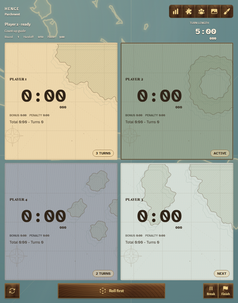
The live app demonstrates why this matters. Spectra reads as a circular glass instrument in Pie. Parchment gives each player a map-like Grid tile. Spacefleet frames the current and upcoming turns in List. These are different views of the same turn sequence.
List browsing is not turn selection: inspecting another row must not move the active clock. Similarly, changing appearance during a game should preserve the session. Those interaction contracts are part of the theme system’s engineering cost.
Visual richness creates a test matrix
The theme registry tests check required tokens, player accents, known IDs and text contrast against key background colors. They provide useful constraints, but token contrast alone cannot prove that every rendered overlay, glow or status label is readable.
Visual review must cover active and inactive tiles, settings, running and paused states, handoff, narrow screens and longer labels. The layout work moved wheel typography toward the actual container size and bundled theme fonts for offline native launch. A cached browser font is not evidence that a fresh mobile install will render the same way.
Shared rules also limit visual excess: inactive tiles should stay flat unless a theme explicitly opts into a different treatment. Animation should follow meaningful state changes and respect reduced-motion preferences.
A preview collection is not a marketplace
The running app includes a broader collection of theme previews. The project’s package-design record separately describes future user-supplied themes, licensing and catalogs. Those plans are not evidence of a completed purchasing or external package-loading service.
The proposed boundary is useful: independently versioned themes and rule packages declare compatibility, and a downloaded theme cannot execute new timing logic. That keeps visual expansion from quietly changing the game’s rules.